Tuesday, 25 March 2014

Photographs used and taken (PAULINE KATE BALUYUT)


Photographs taken


(first Draft)


I didn't use the above image as magazines don't typically use a low angle shot of the model which also hide's their face(s).


(Second Draft)


Before taking the photograph, I have already planned how my model/character would stand and pose. This enabled me to receive a better looking photo than previous attempts. Thus explaining why this is my first and last photograph taken for my second magazine cover draft. 


(Final Draft)


Photographs chosen to use


Friday, 21 March 2014

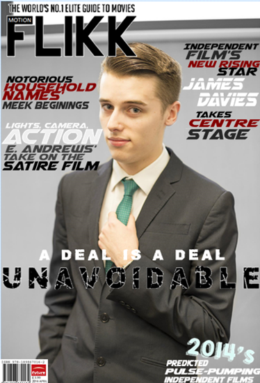
Final magazine front cover draft (PAULINE KATE BALUYUT)


Construction of the barcode :


Below is the feedback/comments I received from my target audience.  


Thursday, 13 March 2014

Photograph manipulation (PAULINE KATE BALUYUT)


First magazine draft, picture manipulation


Second magazine draft, picture manipulation


The image on the left is the original image before any editing/manipulation.


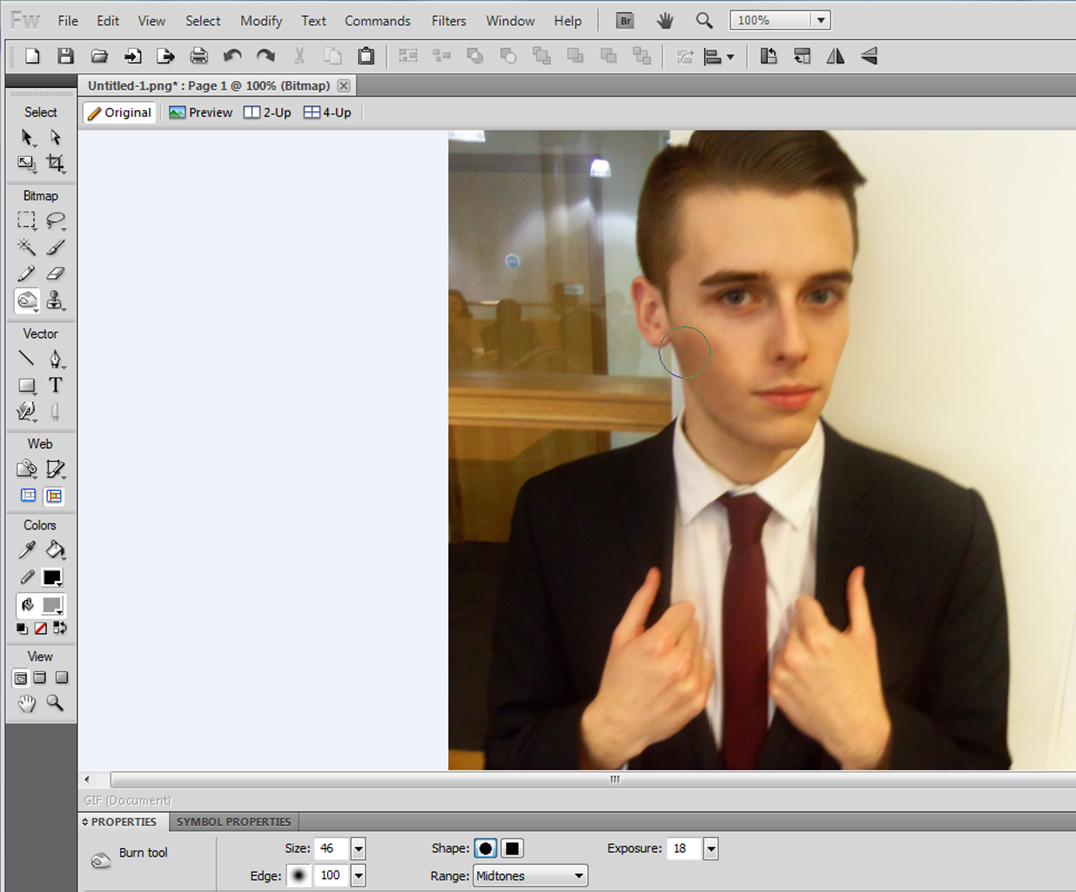
I then placed the image onto Adobe Fireworks CS5.1, an editor where I have attempted to manipulate the picture to suit the film's overall genre and plot.


The above image shows the first result of my experimenting, which I dislike.


Fireworks enabled me to edit the actor's/model's appearance, by letting me select the "burn tool". The tool allowed me to create shadow-like effects onto the models skin.


After experimenting with this tool I then adjusted the size and the exposure of the brush tool. This permitted me to gain a more "natural" result, as shown below:


As I like the results I got, I continued using the "burn tool" until I reached the product below:


After using Adobe Fireworks CS5.1, I still felt that the image needed more editing, as it looked visual appeal and appeared monotonous.


I then decided to use a free photo editing website, 'Fotoflexer' to add effects onto my image. Below is just experiments that I have done:


After doing this, I then stumbled across the "colour splash" edit application. This allows users to select which area will be in black and white, and which area will be in full colour.
 
The image below demonstrates well the process which has allowed me to achieve the image's final outcome.


The image above is the final stage of my second magazine cover, draft picture. 


Final magazine draft, picture manipulation


Step one 
(Again I used Fotoflexer to edit my final draft magazine, picture) I uploaded the image onto their website.


Step two
I selected the "colour splash" option.


Step three
I adjusted the brush and then proceeded to reapplying the colour back onto the image.


Step four 
This is the end result of my editing on Fotoflexer. 


Step Five 
I then saved the image onto my computer, were I will be able to add the rest of the magazine conventions on top of the image, using Microsoft Publisher 2010. 


I used fotoflexer because it enables users to add effects and edit their photos for free, applications also include covering blemishes and morphing pictures together. I have also heard that the editng website had scored an overall "84" from PC world (PC World is a company, widely known for selling gadgets).


Tuesday, 11 March 2014

Audience Survey


To avoid any bias results we have decided to survey both genders (10 females and 10 males). 

From the results shown above, our target market would be both genders, aged 16 - 21 years and are those who also appreciates the genre of drama.
Our trailer should include just the main characters and should last 1.01 mins - 1.30 mins. The music playing on the background should be mostly R&B. The trailer itself, should be fast paced, showing both the characters and the story. The main character should be a male.
Our marketing techniques must include making a trailer, poster and magazine. The poster itself must include bright colours, good reviews and interesting actors as models. Poster will need to be displayed in urban areas where people will be able to see it. Poster must also include the colour blue.
The magazine, on the other hand will need to showcase an aesthetically pleasing image, use eye catching colours and display an interesting actor (very much like the poster).

Monday, 10 March 2014

Proof of development magazine - PAULINE KATE BALUYUT

First draft 


Second draft 


Final draft  


I deliberately chose to depict the model/actor in a smart suit, because this is the typical attire that his character (Richard-Henry) will be shown wearing in the trailer.