The film sweet sixteen, directed by Ken Loach and produced Rebecca O'Brian, it is a social realism film about a teenage boy who was bought up in a broken family. It was realised on the 21st of may 2002, it made a box office income of $316,319.
The name sweet sixteen is a play on words as it is typically linked with young girls turning 16.
The Narrative
It is filmed in the view of a typical 16 year old Scottish boy. The young boy Liam is shown to be a bit of a trouble maker as well as a bit of a joker who spends time mucking about with his mates like most 16 year old boys.
In this essay I will analyse part one of the movie to get an idea on the target audience and the purpose of the film I will do this by looking at three specific things which are camera angles, editing and mise-en-scene.
Camera Shots
In this screen shot we can see a close up which is one of the many camera angles used through out the film, of hands which shows people exchanging money for cigarettes. This tells us that the young boy sells cigarettes in pubs to earn a bit money. It also suggest that he is a stereotypical teenage boy that does everything he can earn a bit of money even if it does involve him committing crimes.
In this screenshot we can see another close up which is of the boys face however we can also see the field in the background which means a wide shot has been used, this lets us to see more of the surroundings and get a clearer idea of the setting. We are shown a different side of the stereotypical troublemaking teenager in this picture, we can see by the expression on his face that he is unhappy, it seems as though he doesn't want to be going where ever it is he's going. He looks as though he is daydreaming or even wishing he was going somewhere else.
Mise-en-scene
This picture shows us what the main character himself is wearing as well as his friends, each of them are wearing a cap and baggy jacket. This emphasis further on the stereotypical view of teenagers and how you would expect the typical troublemaking teenager to be dressed quite scruffy, we can assume that himself and his friends spend their time causing mischief and laughing at other peoples expense. This also gives us a clearer idea on what year this was set in.
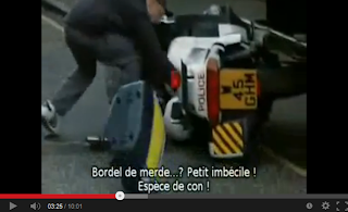
In this picture you can see the young boy standing next to motor bike that has just been knocked down which proves the point that he is mischievous and troublemaking. The medium shot shows that the boy is just about to take the police helmet, this emphasises further on the fact he misbehaves and is involved in criminal activities regularly.
In this picture we can see the teenage boy with his parents and granddad. We can see that his mum is in prison which suggests to us that this could be part of the reason his family is broken. we can see on Liam's face that he doesn't want to be there, we can also see that he is worried about his mum and knows something is wrong.
Editing
At 2:13 there is a straight shot, the camera was on Liam and his friend selling cigarettes and then changed to the bar where we can see the bar owner. The use of straight shot shows us the difference in the characters, the children are trying to earn a living as well as the bar owner however he is furious with the fact that they are doing it in his pub.
Through out the whole film straight shots are used. This helps the film look more realistic.
Conclusion
The film is targeted at young people between the ages of 16-24 as they feel empathy towards the characters. We can see this because of the edditing and camera angles used.


